All of you probably know The Photodiarist. I visit her blog practically everyday and learn a lot about photography from her through her pictures. She takes most of her pictures in Black and White. Her pictures are stunningly beautiful.
Today she posted a series of beach pictures and we got into a discussion over them (read it all at her blogpost). My first impression was that beach pictures with lots of people should be in color, otherwise there seems to be something missing to me. Biana from A little something something brought up the idea of giving them a vintage color theme, which made me think, that if you turn the "pure" black and white into sepia this impression of something missing would be gone. On third thought, to me it seems that this impression of something missing was brought forth by the "plain" sky, there is no structure or depth to it. Well there was obviously cloudless sky, so what should provide this structure?
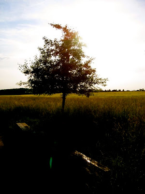
In any case this inspired me to play around with a picture and iPhoto (I've got Gimp but I simply haven't found the time to learn how to use it. *blush*). Here are five versions of the same digital picture I took one evening a few weeks ago. I would love to discuss them with you, so don't hold back your thoughts.
 The original, no alteration.
 Turned black & white.
 Turned sepia.
 Faded colors.
 Saturated colors.
So what do you think works and what not? What impression do you have, when you look at the sepia or the faded or ... picture? How would you do it?
PS: You find my opinion in the comments. Please read those only after you made up your mind on the pictures impressions, as to not cloud your first impression with the other readers thoughts. Thanks.
Source URL: http://lifestyleartsblogs.blogspot.com/2010/06/different-impressions.htmlToday she posted a series of beach pictures and we got into a discussion over them (read it all at her blogpost). My first impression was that beach pictures with lots of people should be in color, otherwise there seems to be something missing to me. Biana from A little something something brought up the idea of giving them a vintage color theme, which made me think, that if you turn the "pure" black and white into sepia this impression of something missing would be gone. On third thought, to me it seems that this impression of something missing was brought forth by the "plain" sky, there is no structure or depth to it. Well there was obviously cloudless sky, so what should provide this structure?
In any case this inspired me to play around with a picture and iPhoto (I've got Gimp but I simply haven't found the time to learn how to use it. *blush*). Here are five versions of the same digital picture I took one evening a few weeks ago. I would love to discuss them with you, so don't hold back your thoughts.
 The original, no alteration.
 Turned black & white.
 Turned sepia.
 Faded colors.
 Saturated colors.
So what do you think works and what not? What impression do you have, when you look at the sepia or the faded or ... picture? How would you do it?
PS: You find my opinion in the comments. Please read those only after you made up your mind on the pictures impressions, as to not cloud your first impression with the other readers thoughts. Thanks.
Visit Lifestyle Arts for daily updated images of art collection


